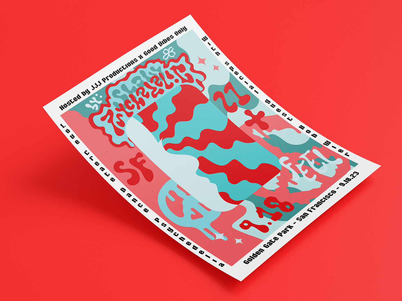
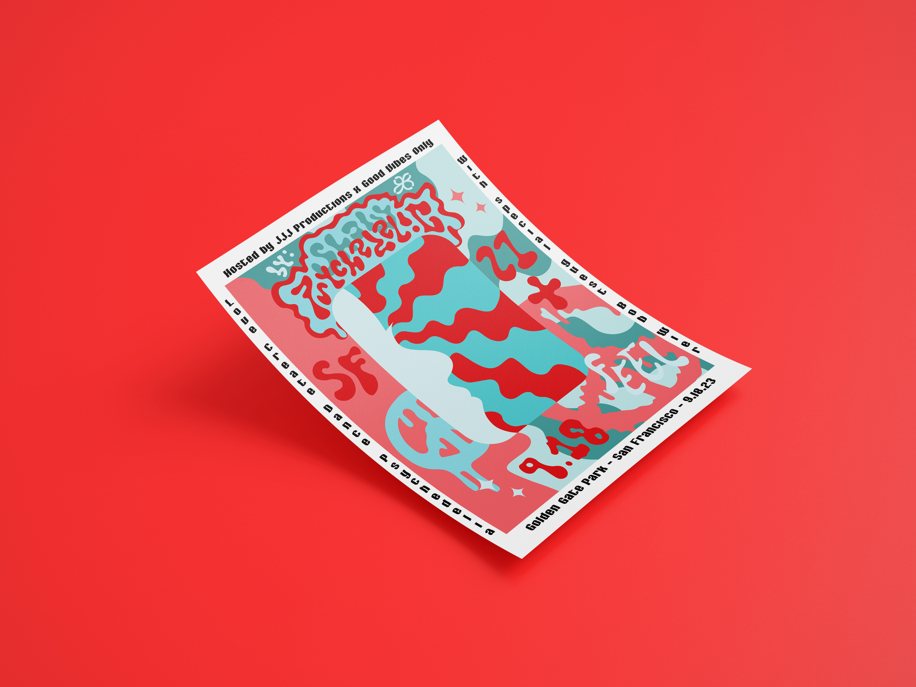
In this design, I was tasked with creating a postcard to advertise an upcoming Swiss design exhibit honoring Josef Muller-Brochmann for the San Francisco Museum of Modern Art (SFMOMA). Experimenting with geometric shapes, grid layouts, and visual hierarchy led to this stunning design.
Color Design
The Design Process
In my initial concept above, I felt it was important to prioritize Josef Muller Brochmann as the focal point. From my research, Swiss design theory tends to lean more into the idea that less is more, but I felt this initial sketch was too simple. However, I still find the idea of highlighting Moma in his name to be clever and wish I expanded further on that idea.
The back is where I started to run into problems, and knew I needed to change my approach. In my final design, I made sure to geometrically align everything, down to the finest details. I created a sense of unity throughout the front and back with a color scheme. I felt it was important to break up the event details to make them more memorable for the viewer.


