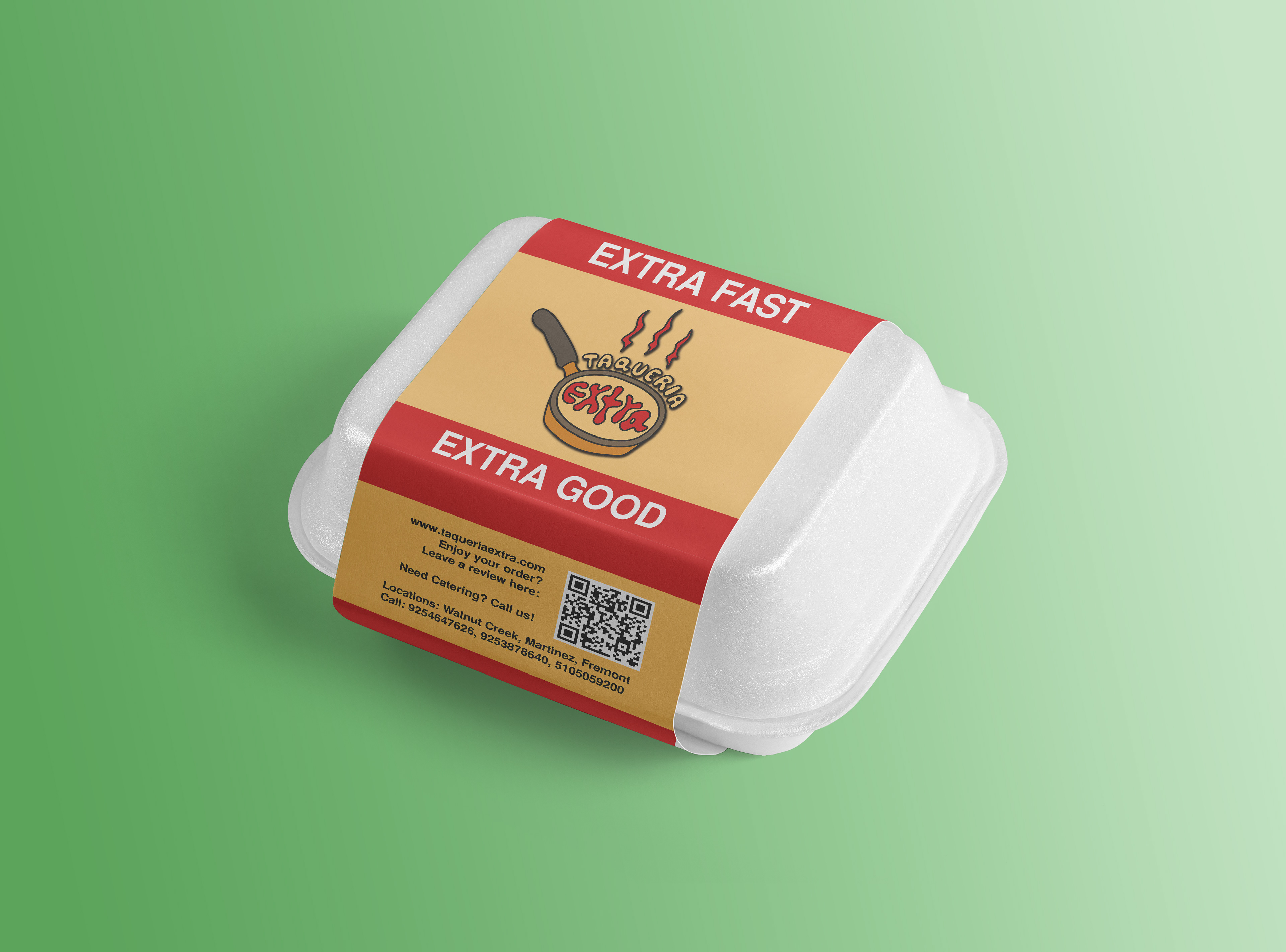
Color Design
Initially red-green serious typography, I felt it could stand out more in a sea of similar competitor branding.
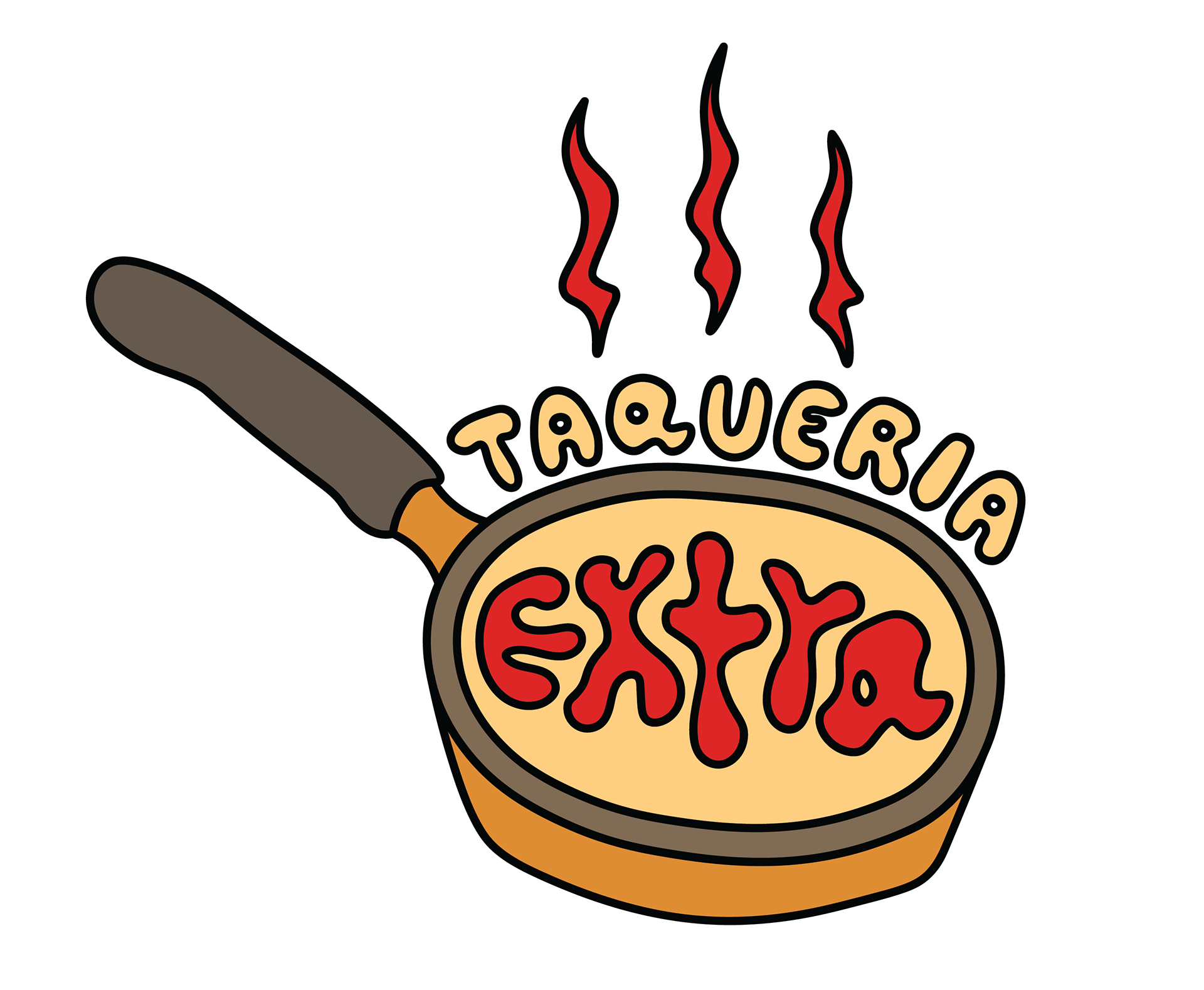
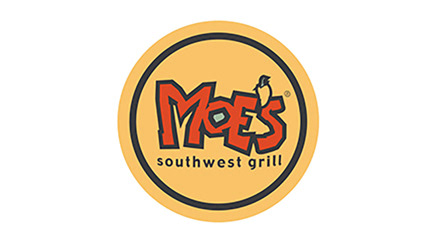
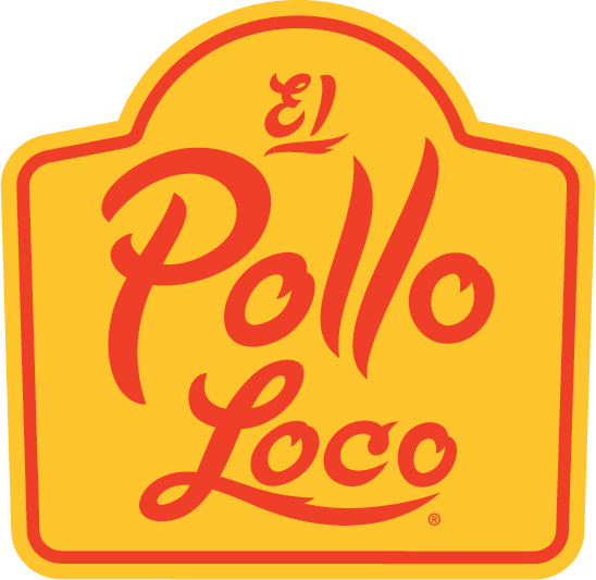
This logo illustration differs from the typical Mexican oriented food color scheme, red and green, to a red-yellow theme that communicates hunger and spice.
According to color theory psychology, red and yellows often give off a feeling of hunger if used correctly. This color scheme is most popularly used by McDonalds, In N Out, and more.
To differentiate from fast food, I toned down the hues to give a higher sense of quality to the brand.

Design Process

One of my first initial design concepts captured the Extra in Taqueria Extra with the t doubling as a + sign.
While I liked this concept, I did feel it strayed too close to the original color scheme and wanted to try a different approach. The pixelized typography is playful, while it's balanced by cursive above.
I think a logo concept this would prove most successful with a build your own meal type restaurant (like Chipotle, Subway, MOD Pizza, etc.)
Reference Images
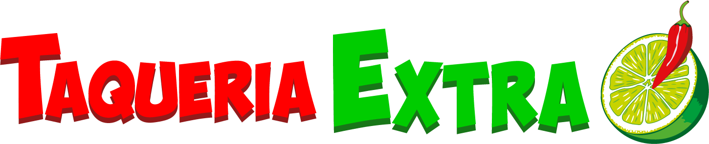
Original Logo
Color Scheme Inspiration
Color Scheme Inspiration