Color Design
In this poster, I try to use a two tone color scheme that uses the original navy blue of Streetwise Self Defense's logo, while using an orange accent to signal action.
Business Card
Design Process
The poster on the left was my reference point; which I found to be cluttered, unorganized, and unsure of what it was trying to communicate.
In order to make it more effective, my goal was to simplify it down to the most important information, and make those immediately clear to the viewer.
I chose to adhere to a more unisex color scheme that is relevant to the event.
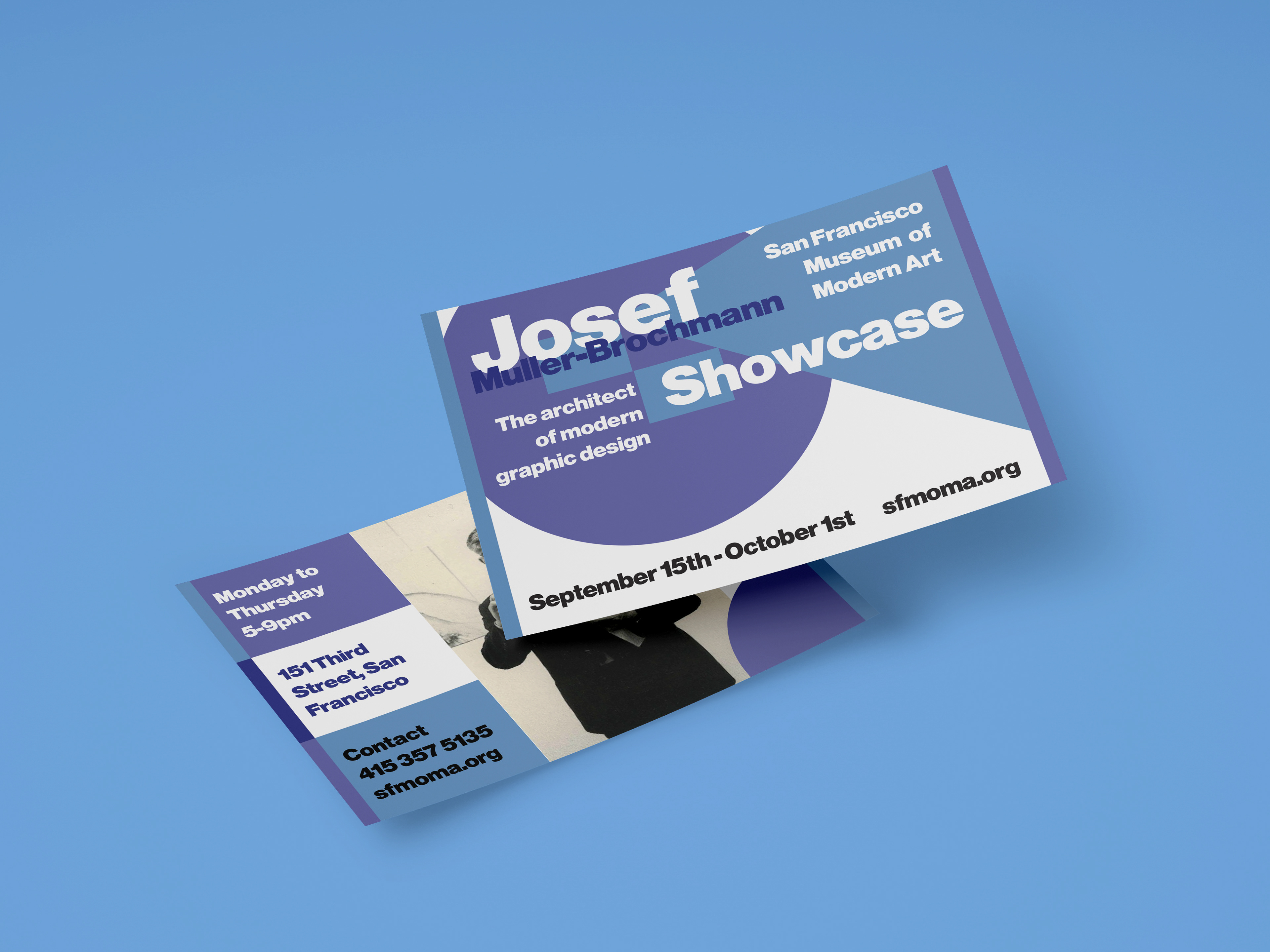
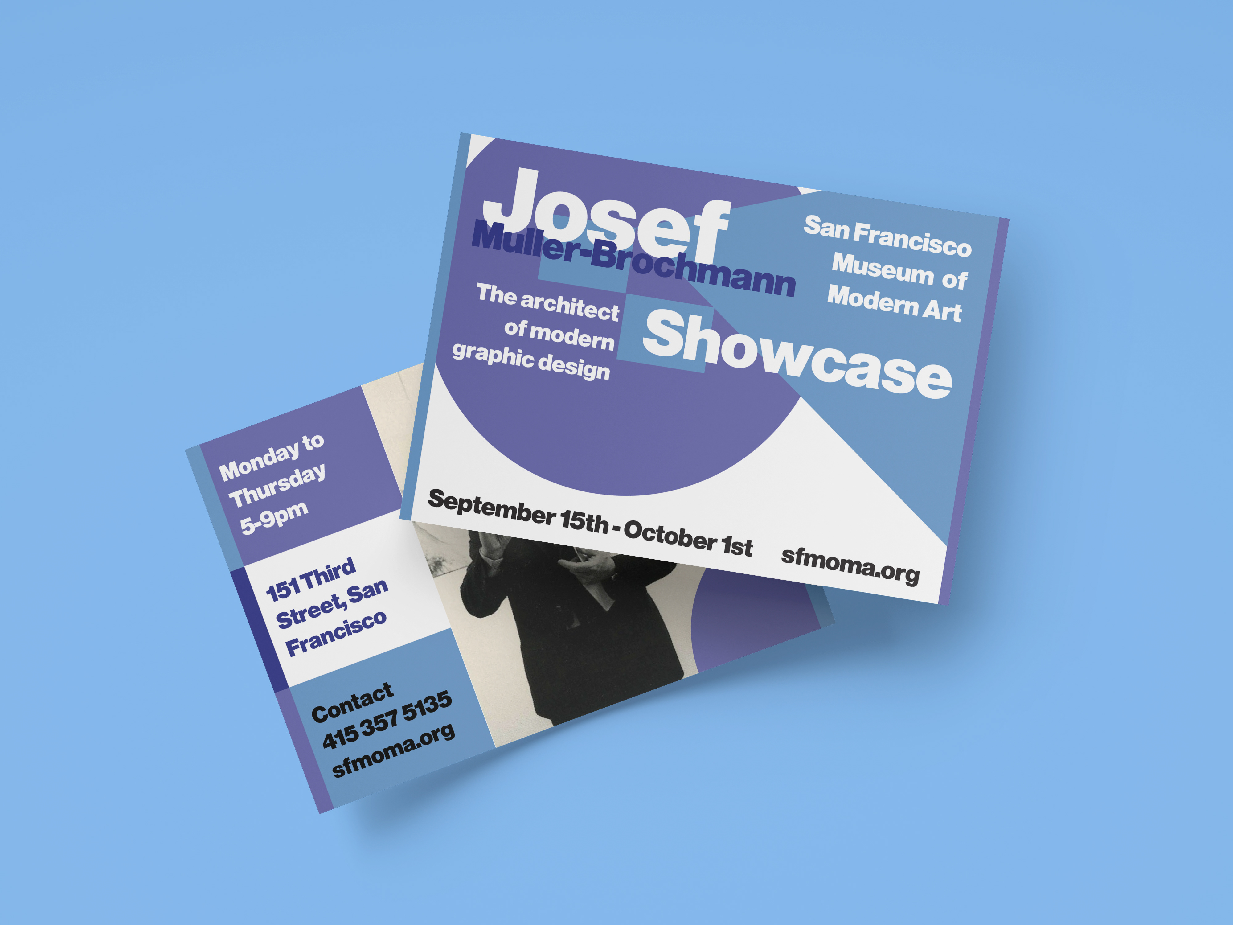
In order to create more design formats, I opted to go for business cards that can double as a social media post. Given the simple layout of the poster, translating it over was surprisingly easy.

